
National Science Foundation
ux Design
The National Science Foundation (NSF) is a United States government agency that supports scientific research and education in science and engineering fields. The NSF promotes health equity, advances science, enhances national security, and sustains the US economy.
My role
User Research, UI + UX Design, Prototyping
Team
Gema H Nava, Jon Hildreth, Larissa Regala, Alex Butterbrodt
TOOLS
Figma
CHALLENGE
The National Science Foundation wants to establish user needs and create a mobile prototype that enables users to apply for research grants/funding that would expedite academic and research institutions to conduct research effectively. The website has seen a significant increase in mobile traffic, though it is not optimized for mobile usage. Users state that the website is difficult to interact with, and challenging to find basic information. The site has poor visuals, leading to accessibility concerns, confusion, and frustrations.
Users should be able to efficiently research and apply for grants, without having to navigate through multiple websites and this process should be improved to generally be more visually organized.
Users need a clear and efficient search process for grant applications. They need to stay organized through grant deadlines, eligibility requirements, and submission of documents without being redirected to multiple websites. Users also need to feel confident when submitting their hard work through an online platform.
SOLUTION
Design an aesthetically pleasing mobile and desktop website with faceted navigation for grant search and seamless document upload flow through a user profile (with saved information and documentation) that provides upload feedback.
COMPARATIVE ANALYSIS
Through our Comparative Analysis we researched other organizations that issue grants to scientific institutions, such as Grants.gov and GrantForward. We specifically looked at the tasks of researching, finding, and applying for grants of interest. The biggest takeaway from this research, was that all of these organizations had a login feature for users, where they can build and access a user profile before applying for a grant. This is something that the National Science Foundation (NSF) currently does not have. This does not allow users to track grant and funding applications.
USER INTERVIEWS
USER #1
AGE: 28
LOCATION: Los Angeles, California
OCCUPATION: Department Chair Special Education
YEARS IN FIELD: 7 years
LOCATION: Los Angeles, California
OCCUPATION: Department Chair Special Education
YEARS IN FIELD: 7 years
USER #2
AGE: 52
LOCATION: Boulder, Colorado
OCCUPATION: Director of Grants + Partnerships
YEARS IN FIELD: 22 years
LOCATION: Boulder, Colorado
OCCUPATION: Director of Grants + Partnerships
YEARS IN FIELD: 22 years
USER #3
AGE: 30
LOCATION: Woods Hole, Massachusetts
OCCUPATION: Coastal Groundwater Hydrologist -NSF EAR Postdoctoral Fellow
YEARS IN FIELD: 8 years
LOCATION: Woods Hole, Massachusetts
OCCUPATION: Coastal Groundwater Hydrologist -NSF EAR Postdoctoral Fellow
YEARS IN FIELD: 8 years
USER #4
AGE: 25
LOCATION: San Diego, California
OCCUPATION: 4th year PhD candidate at University California San Diego in BioEngineering
YEARS IN FIELD: 8 years
LOCATION: San Diego, California
OCCUPATION: 4th year PhD candidate at University California San Diego in BioEngineering
YEARS IN FIELD: 8 years
USER #5
AGE: 42
LOCATION: New York City, New York
OCCUPATION: Editor/Grant Writer for Department of Surgery
YEARS IN FIELD: 15 years
LOCATION: New York City, New York
OCCUPATION: Editor/Grant Writer for Department of Surgery
YEARS IN FIELD: 15 years
INTERVIEW GOALS
The goals of our user interviews was to gain an understanding of the needs, goals, and aspirations that drive the decision-making and behaviors of individuals who regularly submit proposals and apply for grants or funding.
Seeking funding for a non-medical science or engineering institution.
Apply for research grants.
Understand and gauge their trust when uploading important documents to a mobile website.
AFFINITY MAPPING
We organized our findings from user interviews by building an affinity map. This helped us discover key takeaways from our users and identify patterns in their answers. We identified 4 behaviors and needs that all of our users experience. This guides our priorities in developing a redesign of the mobile site.
I want to stay organized so I can make sure I have what is required.
I feel discouraged when applying because the requirements make it seem unattainable.
I need to understand grant eligibility and relevant information.
I have to keep track of several components before submission of a proposal/application.
USER TAKEAWAYS
Through our user interviews we learned that users would not submit a proposal or application for a grant through their mobile device because it is a very involved process. The application and submission process needs to be done on a desktop website.
"I don’t know how I would do that."
"I have all of these documents, I don’t know how to get them on my phone."
"That will create boundaries on how people apply, and will most likely exclude people based on their tech knowledge and not the quality of their program."
"What would be the benefit or purpose of applying on a mobile device?”

Meet Grace, our postdoctoral fellow
After synthesizing our data from the comparative analysis, and user interviews the team started to develop our persona. We focused on one persona as the audience of individuals that would be applying for funding or grants, especially from the National Science Foundation, would be rather small. We knew that we could focus all of the users concerns into one persona. While, our users backgrounds and time in the field are different they all shared many of the same frustrations and behaviors when applying for funding or a grant.

"I love coming up with topics and ideas to study, but writing and submitting a proposal is extremely stressful."
Goals
- Receive grants to fund her projects.
- Contribute to the scientific community through groundbreaking research.
- Investigate the impact of climate change and sea-level rise on threatened coastal environments and communities.
Pains
- There is not an easy way to search for grants by keywords or filter by due dates.
- She has to research, apply and manage all of her grant submissions on different websites.
- Once submitted, months will go by without any notification on the status of her application.
Grace
The Organized Scientist
👩🏽
Age | Gender
36 | Female
Age | Gender
36 | Female
📍
Location
San Diego, CA
Location
San Diego, CA
📚
Education
B.S. Biology + Geology
Education
B.S. Biology + Geology
💼
Occupation
Postdoctoral Fellow
Occupation
Postdoctoral Fellow
Bio
Grace is driven by her curiosity. She always seeks to answer the "why" in every aspect of her life. She loves to read, study and learn new things. She has many people in her life that depend on her; family, colleagues and the scientific community and can feel an immense amount of stress and pressure.
Patient
Detail-oriented
Persistent
Detail-oriented
Persistent
Behaivors
- Constantly digs deeper into processes given her curious and inquisitive nature.
- Is thorough in all aspects of life.
- Carries a deep level of passion for her work which can lead to long hours, improper work-life balance and a general amount of stress.
CARD SORTING
We conducted a Hybrid Card Sort, where users can categorize items in specific categories or create their own category if they feel it does not fit in to any of the categories provided. 13 individuals participated, and 8 of those participants have experience applying for grants or funding. We focused on the results from those 8 individuals. We provided 5 categories for users to sort the cards into; Funding Type, Find Grant Funding, Profile, Education Level and Research Areas. Each category had the predicted items sorted at the highest rates. There were 3 additional categories created by one user; Applicants, Grant Guidelines and Process. These results help guide how we setup how users filter and search for grants and what features would be available in the user profile.
60% of the cards were categorized into 2 or less categories by our users.
Each provided category had an agreement rate of over 50%.
The predicted items in each category ranked the highest by each user.
USER + TASK FLOW
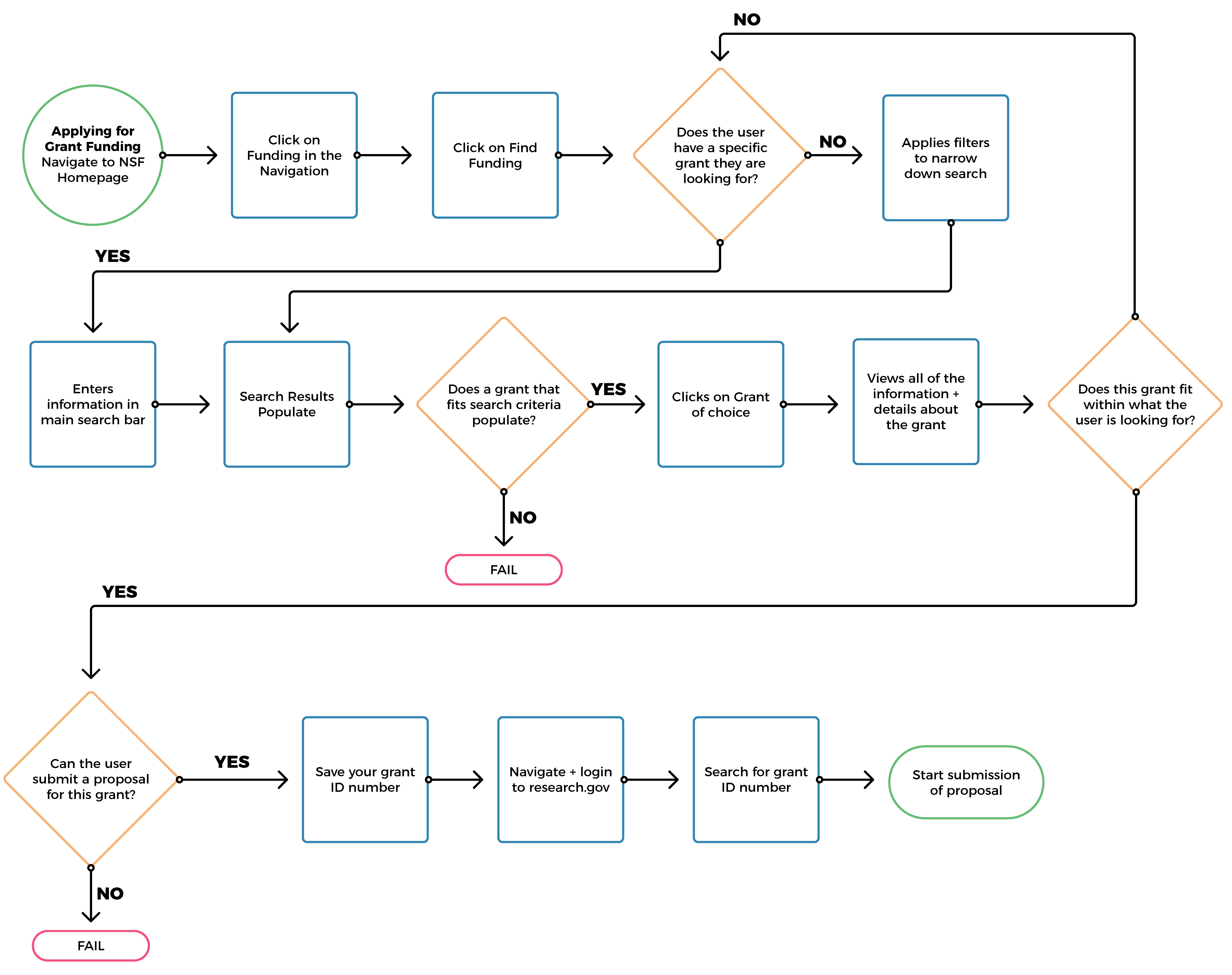
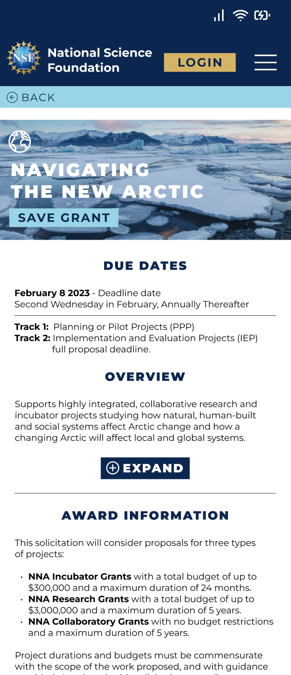
The current task flow that must be taken by users on the current National Science Foundation (NSF)website is confusing and leads the user to a dead end within their website. Users are able to filter and sort their searches through a variety of ways; by education level, field of research, award type and due dates. Users are able to view the important details about the grant such as due dates, funding overview and program contacts. However, this is where the process ends on the NSF website. At this point users must save the Grant ID number, navigate to a different website to login and search for the specific grant and start the proposal and application process.
Current user flow for someone to submit a proposal via the NSF website
Task flow for a user to submit a proposal via desktop computer
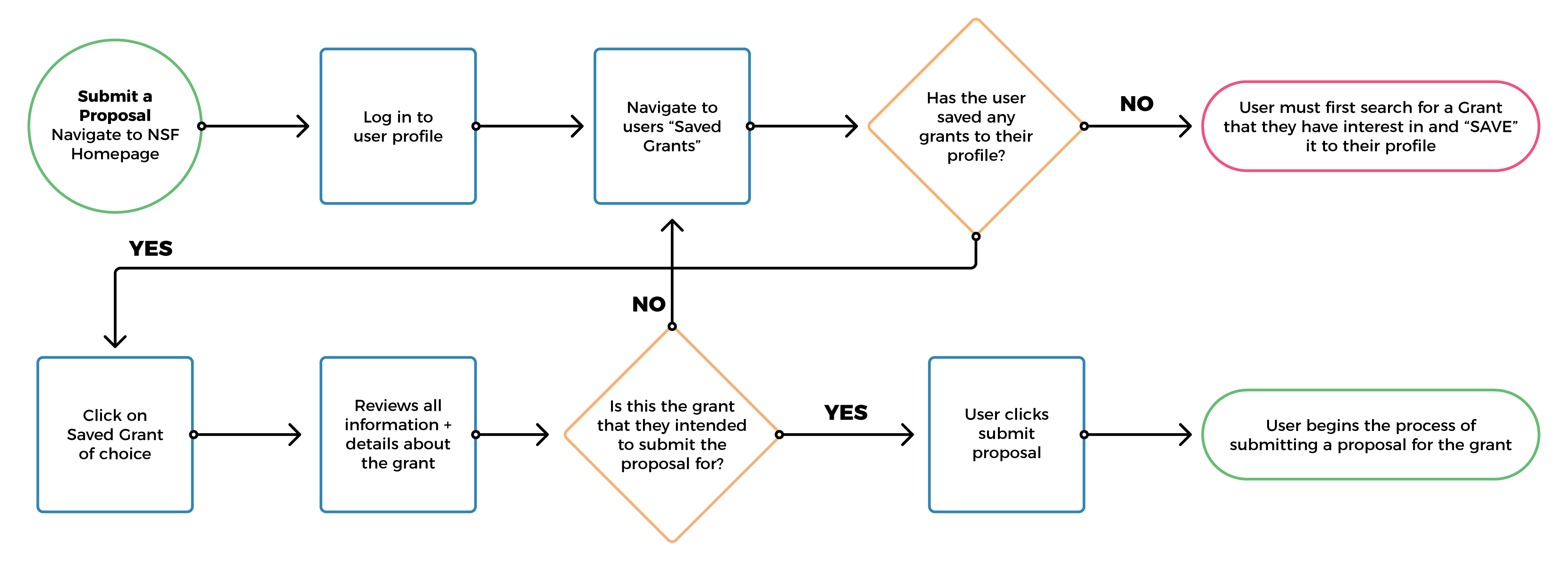
Task flow for a user to save a grant to their profile via mobile/desktop

SKETCHES TO LOW-FIDELITY
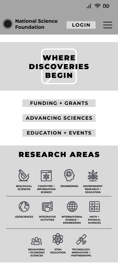
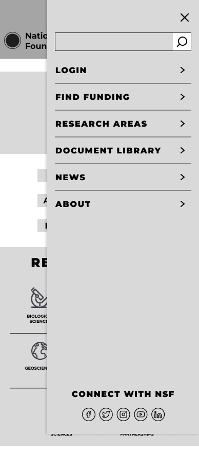
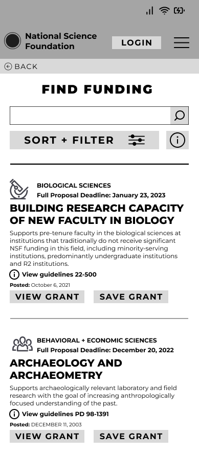
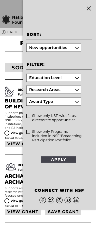
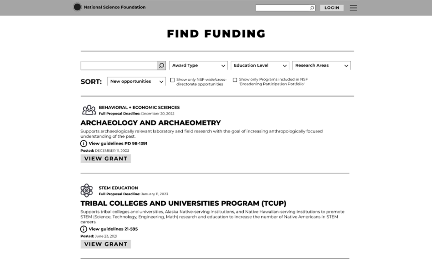
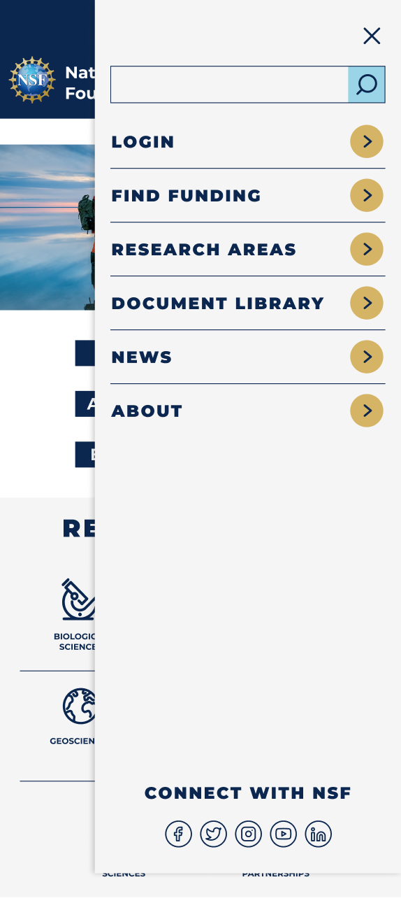
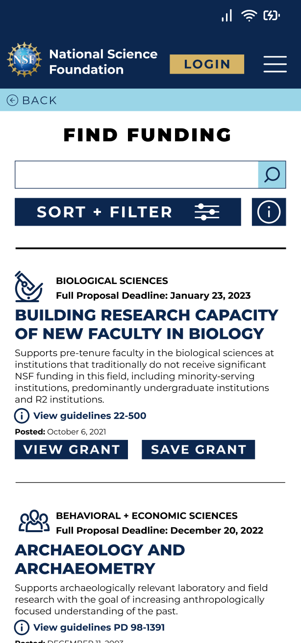
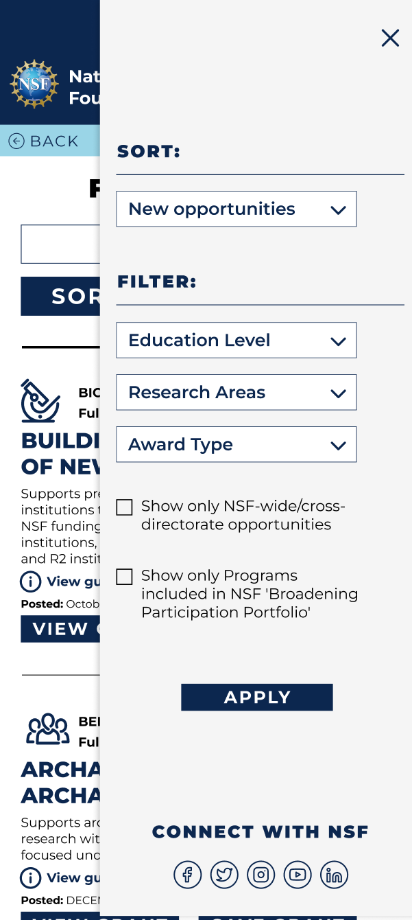
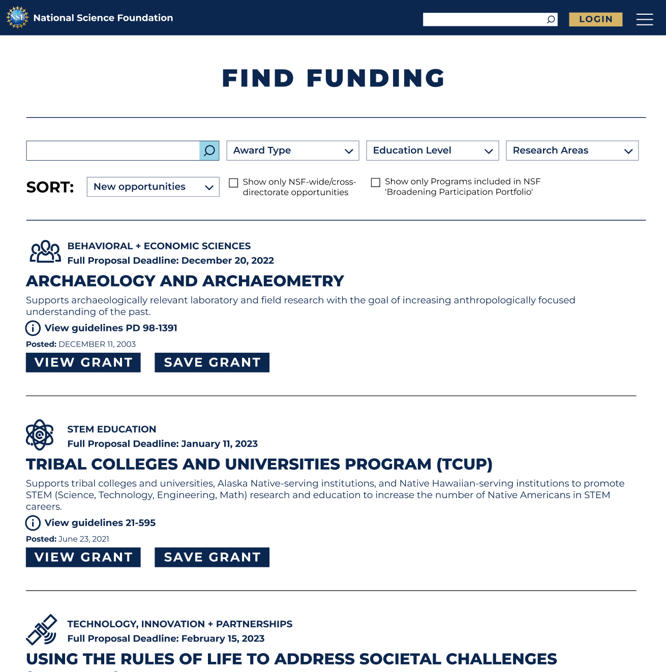
Through sketching we knew that we wanted to focus on making the process of searching for a grant or funding clear and efficient. We made the "Find Funding" page our top priority on the homepage, and the menu. Adding icons help add a visual aid for what area of research the user is searching for. We gave the most important details about the grant prominent hierarchy within the list, and simplified the filters.
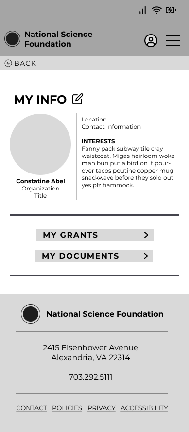
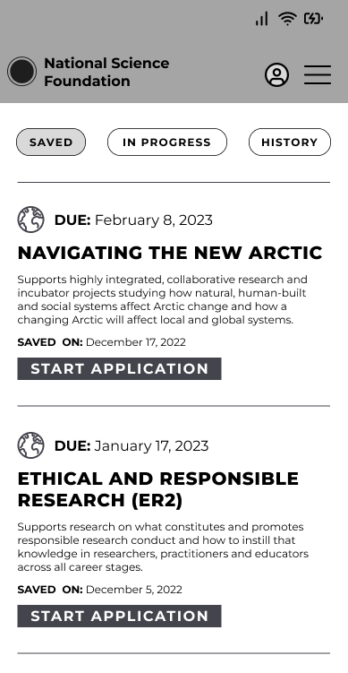
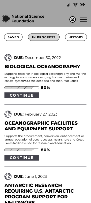
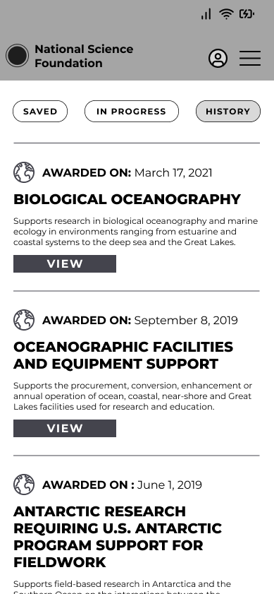
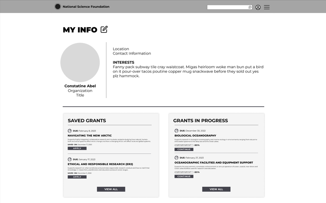
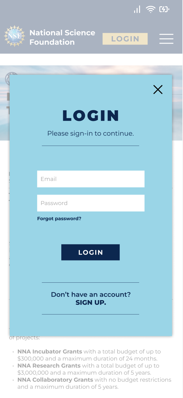
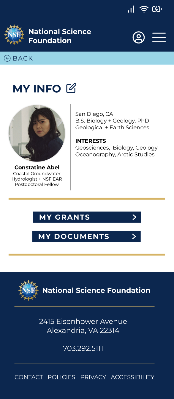
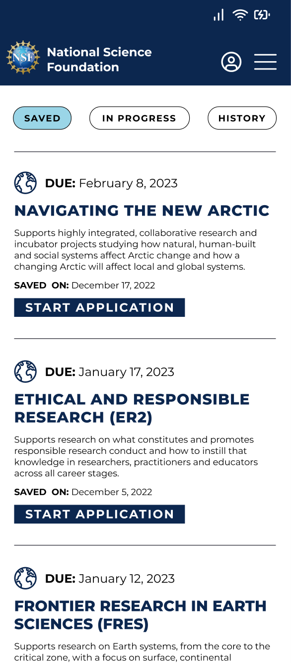
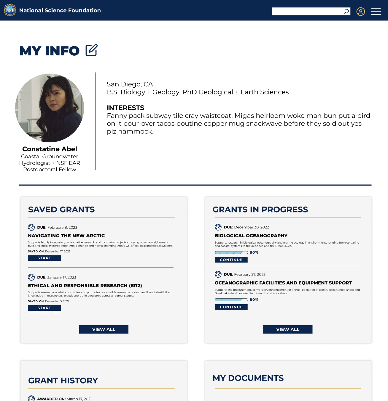
We also built in a user profile, where the user can login to see their saved grants, grants in progress and grant history. Users will also be able to save important documents needed to apply for grants to their profile.
After reviewing our sketches as a team and collectively agreeing on how each page and feature should function we built our low-fidelity prototype to use for usability testing. We also built the desktop platform based on our mobile site and how certain features would translate from mobile to desktop.


USABILITY TESTING
For the Usability Testing we also made sure that our users were individuals who have spent time submitting proposals and applying for grants or funding. We set the scenario for our users through the development of our persona. Our users are driven by their curiosity and are detail-oriented. They carry a deep level of passion in their work and goals are to contribute to the scientific community through groundbreaking research. They use the NSF website to search and apply for research grants regularly.
TASK
Save a grant in Geosciences based on the Arctic to your profile and navigate to your profile to start the application process for that saved grant.
OBJECTIVE
User will be able to search, save, and start the process of applying for a grant within the experience of one website within 4 minutes and with less than 2 errors.
USABILITY RESULTS
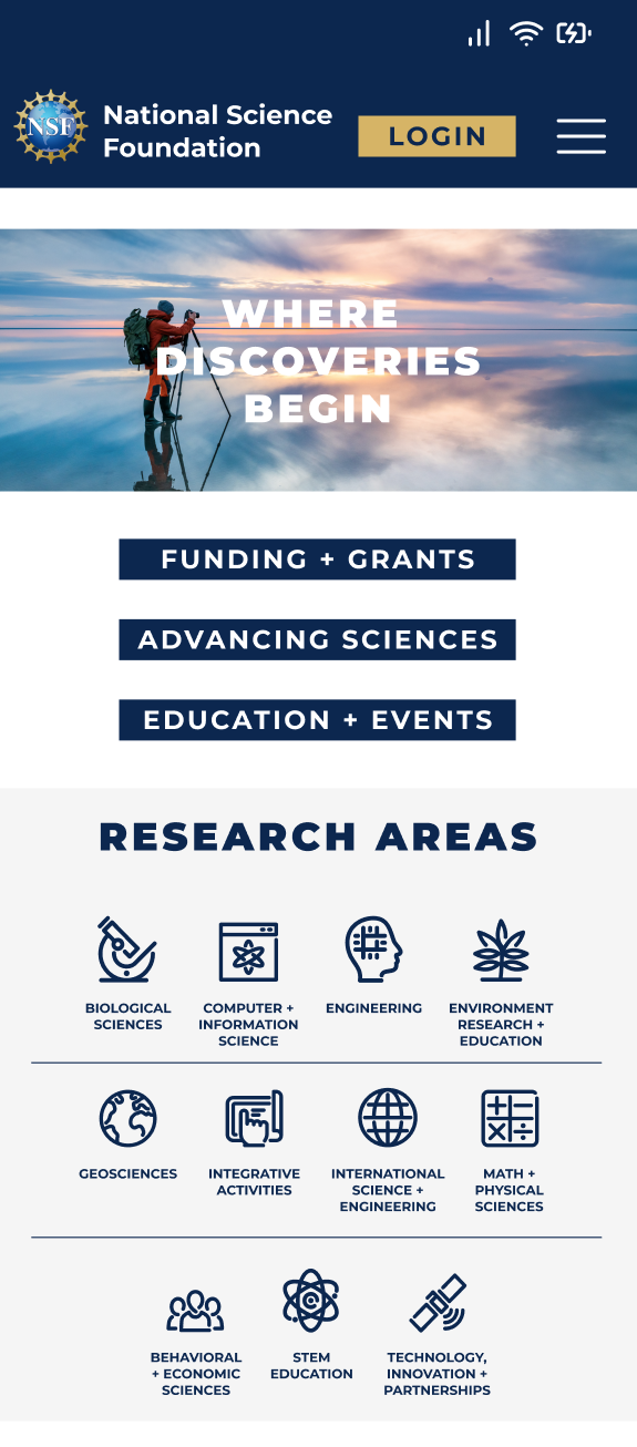
The results from our usability testing drove the functional changes that we made in our prototype. These changes helped the mobile site run smoothly and made finding important information effortless. In the next iteration of our prototype we also added the National Science Foundation branding. We did make changes to the overall look and feel. We simplified the color palette, implemented only one typeface, used bold imagery and added the use of icons throughout the site.
Unclear Navigation
Readability Concerns
Lack of Profile Access
4 out of 5
users noted the absence of “back navigation” throughout the site, creating roadblocks and interrupting browsing flow.
3 out of 5
users noted that there are key pieces of information that they are looking for when submitting a proposal.
3 out of 5
users wanted the ability to access or create their profile before going through the process of saving a grant.
CHANGES MADE TO THE PROTOTYPE
Added seamless back navigation throughout the prototype.
Increased contrast and the size of the text for the information prioritized by the users.
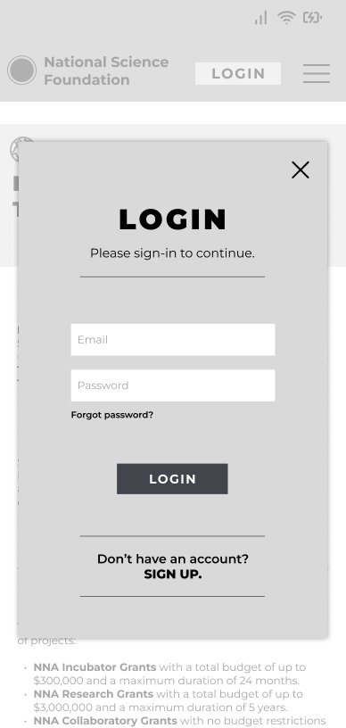
Made logging in to your profile actionable before proceeding to search for the grant.
HIGH-FIDELITY PROTOTYPE
NEXT STEPS
The biggest takeaway from our research was that users would not apply for a grant or funding through a mobile platform because of how intensive the process is. Because of this we would add a module within the mobile user flow, to inform users that the application process must be completed on desktop. We would then continue to design the desktop platform in consistency with our mobile prototype, in which users would actually start grant proposal application process and be able to submit their applications within their profile on the National Science Foundation website.